Structural Packaging Design
Because we turned this product into an experience, the burden of its design fell mostly on its packaging. The contents of the package had to include, at minimum, braiding instructions and enough cord to braid a single sling. It also had to elevate the contents, to an extent, making the product appear more valuable than just a box of string. Additional goals were to make the package in the USA and without plastic.
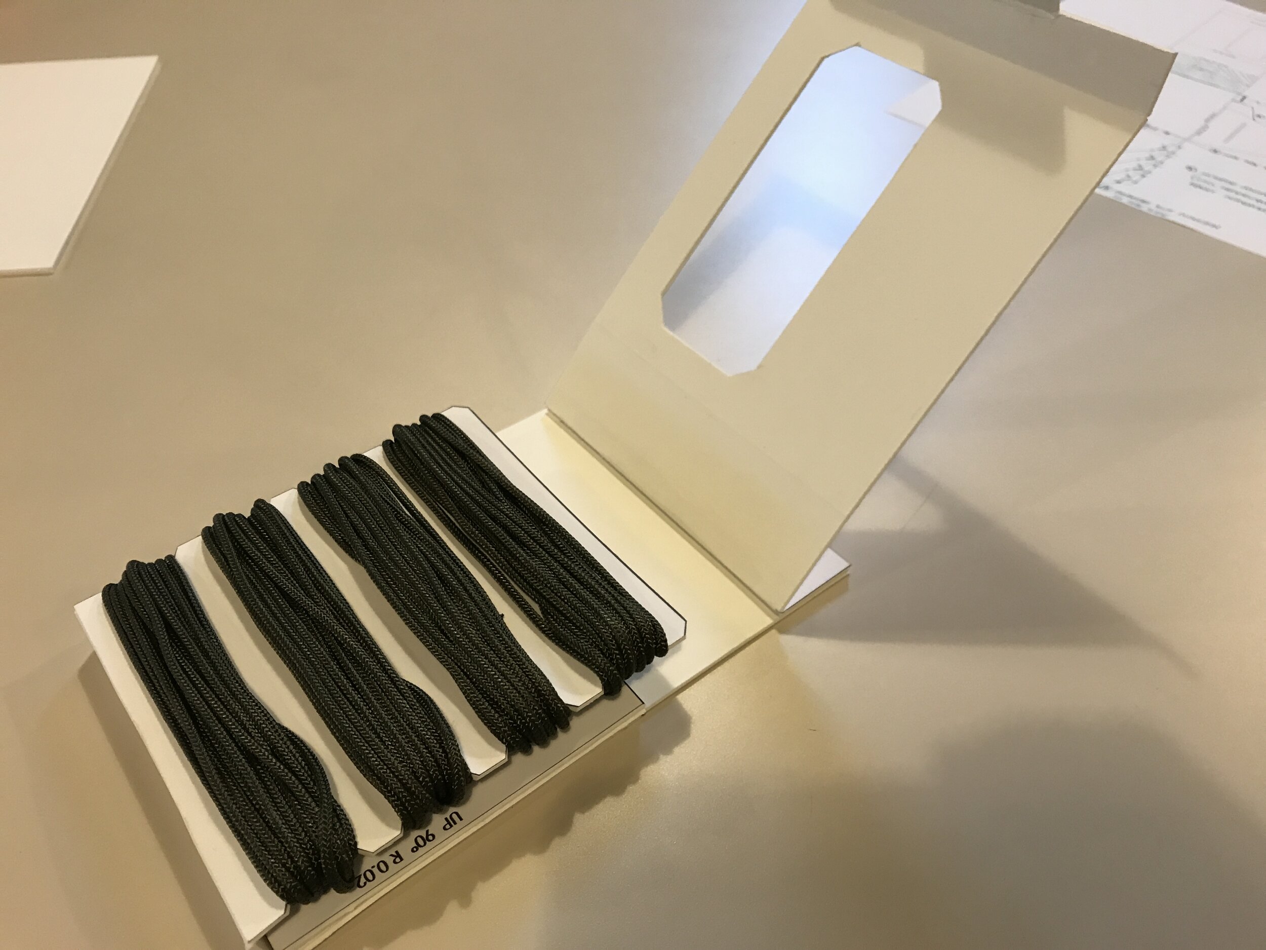
The final product is a folded carton that includes 64ft. of wrapped 325# paracord and cradles a double-sided poster with information and instructions on one side and an inspirational message on the other. The structure of the package includes locking notches to secure the paracord at the start and end of the wrapping process. A double-wall strengthens this portion of the carton to allow the use of thinner stock. (Thank you to Jim and the team at Cincinnati Printers for coming up with this aspect of the design!) Additional locking features secure the lapels that cradle the poster and the tab that locks the entire structure closed.
Graphically, the carton includes a digital camouflage exterior with an aggressive typeface and simple direct messaging. A diagram on the back highlights the output of the project and provides an overview of its capabilities.Once opened, the package presents its contents and exposes a bold WARNING message that cautions users on the dangers and proper use of the product, once complete. Design of the carton unfolded in less than a day, prototyping was executed in just a few hours, and the final design changed little from its original die lines.


The double-sided poster is meant to last beyond the construction of the sling. The instructions on one side teach the history, sizing, braiding and use of a shepherd’s sling. They include measurements on one edge for quick reference and to provide a place to jot down the sizes of other users. Once the instructions are mastered, the poster can be flipped and hung on the wall to display an inspirational message specific to this audience. If a user needs access to the instructions in the future he/she need just remove the poster from the wall for reference or refer to the printed links on the poster (QR codes).
The inspirational side of the poster provides an inspirational quote from America’s most rugged president.
The instructional side of the poster provides warning information, teaches the history and ballistics of the sling, and describes its sizing, construction and use.
The design of this package provides layers of experience as it unfolds. On the shelf, it increases interest by highlighting the colored paracord within. On the back, a diagram and short body of text briefly explain the subject and purpose of the kit. At home, the package further unfolds to expose additional layers — each with greater levels of information. It first showcases the cord and contents; next, to access the instructions, the user is forced to see the printed warning; finally, the poster — containing a huge amount of information and links to more — is revealed.
Future embodiments of the package and poster design will be targeted at a younger audience. These will likely feature craft paper construction, single color offset printing and a poster geared to dog owners, scouts and children.


